Google is currently trying out a refreshed look for its Gemini app on iPhones. This update focuses on a cleaner design, subtle animations, and easier navigation. The goal seems simple—make the app feel smoother, more modern, and less complicated for everyday users.
At the moment, this new design is only visible to a small number of iOS users. There is no official confirmation yet on when it will be released to everyone.
Also read: How to Locate and Wipe a Lost iPhone Using Find My
How the Updated Interface Feels
Early previews show a noticeable change in the overall experience of the app.
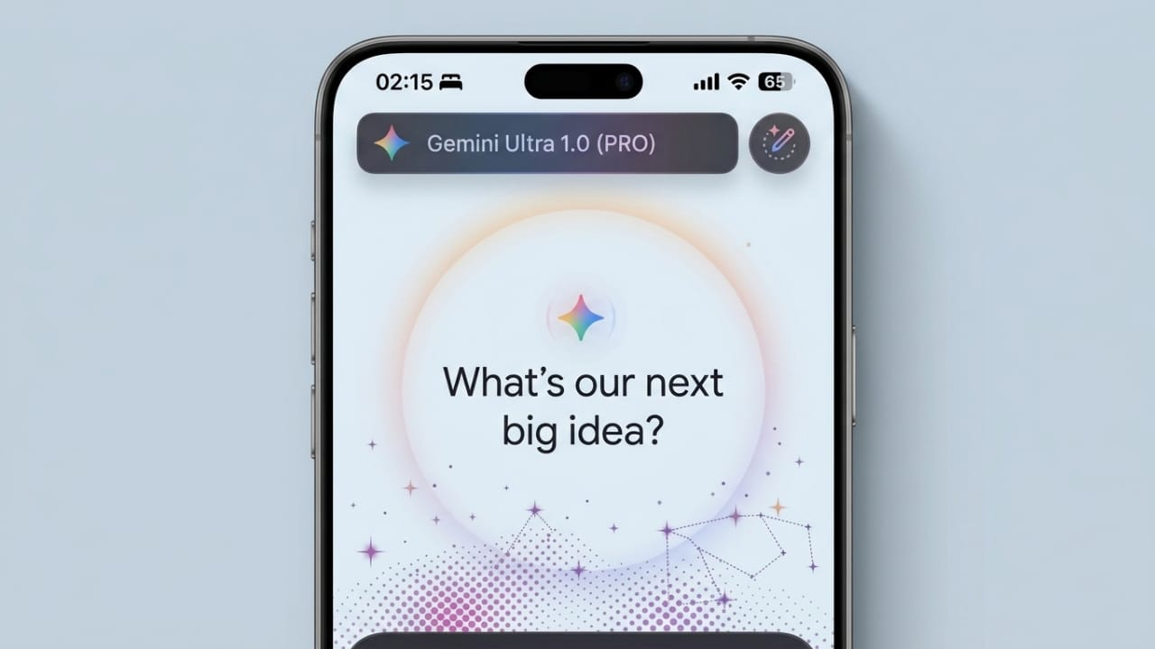
Instead of a static layout, the new version introduces light animations that make the screen feel more alive. A soft animated background appears behind the input area, while the main text box is placed neatly in the center with Gemini branding.
As users interact with the app, small visual responses add to the experience. These subtle movements make the app feel quicker and more responsive, even during simple actions.
Easier Access to Features
Another major improvement appears to be how tools are organized.
The plus (+) button may now open a single menu that includes multiple features in one place. This could include options like:
- Creating images
- Using the camera
- Accessing music-related tools
- Opening creative workspace (canvas)
- Running deeper research tasks
- Uploading files
This approach reduces the need to switch between different sections, making the app easier to navigate.
Cleaner Look and Better Readability
The redesign also focuses on improving how content appears on the screen.
Some expected changes include softer colors, better spacing between elements, and smoother transitions. These small adjustments can make reading and interacting with the app more comfortable.
On iOS, the design may also include a glass-like visual style, giving it a more polished and premium feel.
Still in Testing Phase
Right now, this update is not widely available.
- It has only been seen on iPhones
- Even among iOS users, only a limited group has access
- Android users have not received this update yet
This suggests that Google is still testing the design before deciding on a full release.
Why This Update Matters
This redesign is not just about appearance. It likely aims to improve the overall experience of using the app.
A simpler layout can help users find features faster. Smooth animations can make interactions feel more natural. At the same time, a modern design helps the app stay competitive with other AI tools that already offer polished interfaces.
A Practical View
While the new look is promising, design alone cannot solve everything.
If the app runs slowly, a better interface will not fix that. If features remain confusing, visuals will not be enough. Also, if updates are not consistent across platforms, users may feel the difference.
So, the success of this update will depend on how well everything works together—not just how it looks.
Also read: Google May Introduce Ads in Gemini AI to Support Its Growing Platform
Final Words
The new Gemini design on iOS shows that Google is working toward a smoother and more user-friendly AI experience. With cleaner visuals and improved navigation, the app could become more enjoyable to use.
However, since this is still an early test, it is not the final version. More changes may come before a full rollout.

I am a passionate Tech Writer with strong industry experience. I enjoy exploring the latest technological innovations and sharing clear, helpful insights with my audience.”